1,262 search results
(0.006 seconds)
- Edo - Unknown license

- Nemo - Unknown license

- Exo - 100% free

- Ego - Unknown license

- eko - Unknown license

- Demos by Linotype,
$29.99 - Eco by FSD,
$50.00 - Memo by Monotype,
$29.99
- Epos by Serebryakov,
$39.00
- Emotion by Corradine Fonts,
$19.95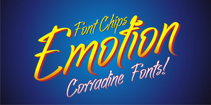
- Lemos by Goodigital13,
$20.00
- Oliandre Demo - Personal use only

- Rotterdam Demo - Personal use only

- Argithea DEMO - Personal use only

- Melonday Demo - Personal use only

- Platthand Demo - Unknown license

- Caswallon Demo - Unknown license

- Nemo Nightmares - Unknown license

- Alter-Ego - Unknown license

- Clairveaux Demo - Unknown license

- Carmilla Demo - Unknown license

- San Remo - Personal use only

- Guede Demo - Unknown license

- HaydenPanettiereBats demo - Unknown license

- Hendrix Demo - Unknown license

- Azariel Demo - Unknown license

- Hesperides Demo - Unknown license

- Hadrianus Demo - Unknown license

- Zahariel Demo - Unknown license

- Padstow Demo - Unknown license

- Butterfield Demo - Unknown license

- Morgow Demo - Unknown license

- Dirty Ego - 100% free

- Interlude Demo - Unknown license

- Wanax Demo - Unknown license

- Jerash Demo - Unknown license

- Isfahan Demo - Unknown license

- Alecto Demo - Unknown license

- Gaheris Demo - Unknown license

- Ithuriel Demo - Unknown license


Page 1 of 32Next page